Scikit-learn: Practical Applications
- 1. Introduction to Scikit-Learn
- 2. Linear Regression with Scikit-Learn
- 3. Multiple Linear Regression with Scikit-Learn
- 4. Polynomial Regression with Scikit-Learn
- 5. Binary Classification with Logistic Regression
- 6. Multi-Class Classification with Logistic Regression
1. Introduction to Scikit-Learn
Scikit-Learn is one of the most popular and powerful Python libraries for machine learning. It provides efficient implementations of various machine learning algorithms and tools for data preprocessing, model selection, and evaluation. It is built on top of NumPy, SciPy, and Matplotlib, making it highly compatible with the scientific computing ecosystem in Python.
Why Use Scikit-Learn?
- Easy to Use: Provides a simple and consistent API for machine learning models.
- Comprehensive: Includes a wide range of algorithms, including regression, classification, clustering, and dimensionality reduction.
- Efficient: Implements fast and optimized versions of ML algorithms.
- Integration: Works well with other libraries like Pandas, NumPy, and Matplotlib.
Loading Built-in Datasets in Scikit-Learn
Scikit-Learn provides several built-in datasets that can be used for practice and experimentation. Some common datasets include:
- Iris Dataset (
load_iris): Classification dataset for flower species. - Boston Housing Dataset (
load_boston) (Deprecated): Regression dataset for predicting house prices. - Digits Dataset (
load_digits): Handwritten digit classification. - Wine Dataset (
load_wine): Classification dataset for different types of wine. - Breast Cancer Dataset (
load_breast_cancer): Binary classification dataset for cancer diagnosis.
Example: Loading and Exploring the Iris Dataset
from sklearn.datasets import load_iris
import pandas as pd

# Load the dataset
iris = load_iris()

# Convert to DataFrame
iris_df = pd.DataFrame(iris.data, columns=iris.feature_names)

# Add target labels
iris_df['target'] = iris.target

# Display first few rows
print(iris_df.head())
Splitting Data: Train-Test Split
To evaluate a machine learning model, we need to split the data into a training set and a test set. This ensures that we can measure the model’s performance on unseen data.
Scikit-Learn provides train_test_split for this purpose:
Example: Splitting the Iris Dataset
from sklearn.model_selection import train_test_split

# Features and target variable
X = iris.data
y = iris.target

# Split into 80% training and 20% testing
X_train, X_test, y_train, y_test = train_test_split(X, y, test_size=0.2, random_state=42)

print(f"Training samples: {len(X_train)}, Testing samples: {len(X_test)}")
test_size=0.2means 20% of the data is reserved for testing.random_state=42ensures reproducibility.
By following these steps, we have successfully loaded a dataset and prepared it for machine learning. In the next section, we will explore how to apply Linear Regression using Scikit-Learn.
Train-Test Split and Why It Matters
When training a machine learning model, we must evaluate its performance on unseen data to ensure it generalizes well. This is done by splitting the dataset into training and test sets.
Why Not Use 100% of Data for Training?
If we train the model using all available data, we won’t have any independent data to check how well it performs on new inputs. This leads to overfitting, where the model memorizes the training data instead of learning general patterns.
Why Not Use 90% or More for Testing?
While a large test set gives a better estimate of real-world performance, it reduces the amount of data available for training. A model trained on very little data may suffer from underfitting—it won’t have enough information to learn meaningful patterns.
What’s the Ideal Train-Test Split?
A commonly used ratio is 80% for training, 20% for testing. However, this depends on:
- Dataset Size: If data is limited, we may use a 90/10 split to keep more training data.
- Model Complexity: Simpler models may work with less training data, but deep learning models require more.
- Use Case: In critical applications (e.g., medical diagnosis), a larger test set (e.g., 30%) is preferred for reliable evaluation.
Key Takeaways
✅ 80/20 is a good starting point, but can vary based on dataset size and model needs.
✅ Too small a test set → Unreliable performance evaluation.
✅ Too large a test set → Model may not have enough training data to learn properly.
✅ Always shuffle the data before splitting to avoid biased results.
2. Linear Regression with Scikit-Learn
1. Introduction to Linear Regression
Linear regression is a fundamental supervised learning algorithm used to model the relationship between a dependent variable (target) and one or more independent variables (features). It assumes a linear relationship between input features and the output.
The mathematical form of a simple linear regression model is:
Where:
- is the predicted output.
- is the input feature.
- is the intercept (bias).
- is the coefficient (weight) of the feature.
Now, let’s implement a simple linear regression model using Scikit-Learn.
2. Importing Required Libraries
First, we import necessary libraries for handling data, building the model, and evaluating its performance.
import numpy as np
import matplotlib.pyplot as plt
import pandas as pd
from sklearn.model_selection import train_test_split
from sklearn.linear_model import LinearRegression
from sklearn.metrics import mean_squared_error, r2_score
3. Creating a Sample Dataset
We will generate a synthetic dataset to train and test our linear regression model.
# Generate random data
np.random.seed(42)  # Ensures reproducibility
X = 2 * np.random.rand(100, 1)  # 100 samples, single feature
y = 4 + 3 * X + np.random.randn(100, 1)  # y = 4 + 3X + Gaussian noise

# Convert to a DataFrame for better visualization
df = pd.DataFrame(np.hstack((X, y)), columns=["Feature X", "Target y"])
df.head()
np.random.rand(100, 1): Generates random values between and .y = 4 + 3X + noise: Defines a linear relationship with some added noise.- We use
pd.DataFrameto display the first few samples.
4. Splitting Data into Training and Testing Sets
It is crucial to split the dataset into training and testing sets to evaluate model performance on unseen data.
# Splitting dataset into 80% training and 20% testing
X_train, X_test, y_train, y_test = train_test_split(X, y, test_size=0.2, random_state=42)

print(f"Training set size: {X_train.shape[0]} samples")
print(f"Testing set size: {X_test.shape[0]} samples")
5. Training the Linear Regression Model
Now, we train a linear regression model using Scikit-Learn’s LinearRegression() class.
# Create and train the model
model = LinearRegression()
model.fit(X_train, y_train)

# Print learned parameters
print(f"Intercept (theta_0): {model.intercept_[0]:.2f}")
print(f"Coefficient (theta_1): {model.coef_[0][0]:.2f}")
fit(X_train, y_train): Trains the model by finding the best-fitting line.model.intercept_: The learned bias term.model.coef_: The learned weight for the feature.
6. Making Predictions
After training, we make predictions on the test set.
# Predict on test data
y_pred = model.predict(X_test)

# Compare actual vs predicted values
comparison_df = pd.DataFrame({"Actual": y_test.flatten(), "Predicted": y_pred.flatten()})
comparison_df.head()
model.predict(X_test): Generates predictions.- The DataFrame compares actual vs. predicted values.
7. Evaluating the Model
We use Mean Squared Error (MSE) and R² Score to evaluate model performance.
# Calculate Mean Squared Error (MSE)
mse = mean_squared_error(y_test, y_pred)

# Calculate R-squared score
r2 = r2_score(y_test, y_pred)

print(f"Mean Squared Error: {mse:.2f}")
print(f"R-squared Score: {r2:.2f}")
- MSE: Measures average squared differences between actual and predicted values (lower is better).
- R² Score: Measures how well the model explains the variance in the data (closer to 1 is better).
8. Visualizing the Results
Finally, let’s plot the data and the regression line.
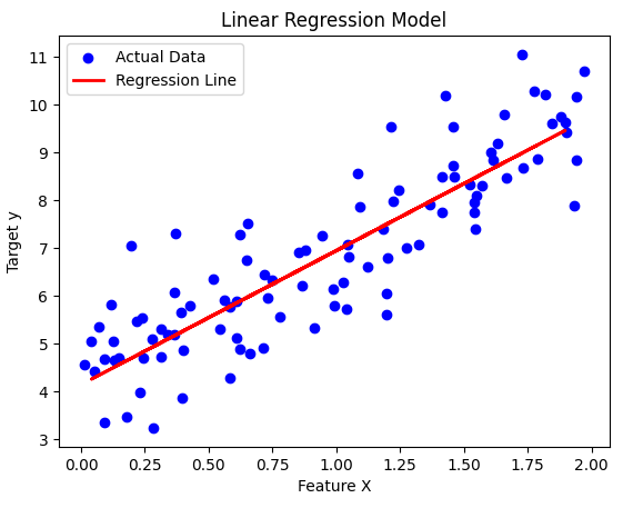
plt.scatter(X, y, color="blue", label="Actual Data")
plt.plot(X_test, y_pred, color="red", linewidth=2, label="Regression Line")
plt.xlabel("Feature X")
plt.ylabel("Target y")
plt.title("Linear Regression Model")
plt.legend()
plt.show()
This plot shows:
- Blue points → Actual test data
- Red line → Best-fit regression line
3. Multiple Linear Regression with Scikit-Learn
What is Multiple Linear Regression?
Multiple Linear Regression is an extension of simple linear regression where we predict a dependent variable () using multiple independent variables (). The general form of the equation is:
Where:
- = predicted output
- = independent variables (features)
- = intercept
- = coefficients (weights)
In this section, we will:
- Generate a synthetic dataset for a multiple linear regression model.
- Train a model using Scikit-Learn.
- Visualize the relationship in a 3D plot.
Step 1: Generate a Synthetic Dataset
First, let’s create a dataset with two independent variables ( and ) and one dependent variable (). We’ll add some noise to make it more realistic.
import numpy as np
import matplotlib.pyplot as plt
from mpl_toolkits.mplot3d import Axes3D
from sklearn.linear_model import LinearRegression
from sklearn.model_selection import train_test_split

# Set seed for reproducibility
np.random.seed(42)

# Generate random data for x1 and x2
x1 = np.random.uniform(0, 10, 100)
x2 = np.random.uniform(0, 10, 100)

# Define the true equation y = 3 + 2*x1 + 1.5*x2 + noise
y = 3 + 2*x1 + 1.5*x2 + np.random.normal(0, 2, 100)

# Reshape x1 and x2 for model training
X = np.column_stack((x1, x2))
Step 2: Train the Model
Now, we split the dataset into training and test sets and train a multiple linear regression model.
# Split data into training and test sets
X_train, X_test, y_train, y_test = train_test_split(X, y, test_size=0.2, random_state=42)

# Create and train the model
model = LinearRegression()
model.fit(X_train, y_train)

# Get model parameters
theta0 = model.intercept_
theta1, theta2 = model.coef_
print(f"Model equation: y = {theta0:.2f} + {theta1:.2f}*x1 + {theta2:.2f}*x2")
Step 3: Visualize the Regression Plane
Since we have two independent variables ( and ), we can plot the regression plane in 3D space.
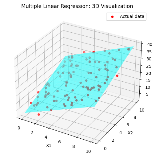
# Generate grid for x1 and x2
x1_range = np.linspace(0, 10, 20)
x2_range = np.linspace(0, 10, 20)
x1_grid, x2_grid = np.meshgrid(x1_range, x2_range)

# Compute predicted y values
y_pred_grid = theta0 + theta1 * x1_grid + theta2 * x2_grid

# Create 3D plot
fig = plt.figure(figsize=(10, 6))
ax = fig.add_subplot(111, projection='3d')

# Scatter plot of real data
ax.scatter(x1, x2, y, color='red', label='Actual data')

# Regression plane
ax.plot_surface(x1_grid, x2_grid, y_pred_grid, alpha=0.5, color='cyan')

# Labels
ax.set_xlabel('X1')
ax.set_ylabel('X2')
ax.set_zlabel('Y')
ax.set_title('Multiple Linear Regression: 3D Visualization')
plt.legend()
plt.show()
Key Takeaways
- We generated a dataset with two independent variables and one dependent variable.
- We trained a Multiple Linear Regression model using Scikit-Learn.
- We visualized the regression plane in 3D, showing how and influence .
4. Polynomial Regression with Scikit-Learn
Polynomial Regression is an extension of Linear Regression, where we introduce polynomial terms to capture non-linear relationships in the data.
1. What is Polynomial Regression?
Linear regression models relationships using a straight line:
However, if the data follows a non-linear pattern, a straight line won’t fit well. Instead, we can introduce polynomial terms:
This allows the model to capture curvature in the data.
2. Generating Non-Linear Data
First, let’s create a synthetic dataset with a non-linear relationship.
import numpy as np
import matplotlib.pyplot as plt

# Generate random x values between -3 and 3
np.random.seed(42)
X = np.linspace(-3, 3, 100).reshape(-1, 1)

# Generate a non-linear function with some noise
y = 0.5 * X**3 - X**2 + 2 + np.random.randn(100, 1) * 2

# Scatter plot of the data
plt.scatter(X, y, color='blue', alpha=0.5, label="True Data")
plt.xlabel("X")
plt.ylabel("y")
plt.title("Generated Non-Linear Data")
plt.legend()
plt.show()
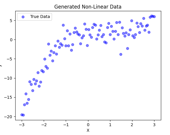
- We create 100 random points between -3 and 3.
- The function we generate follows a cubic equation:
- with added noise.
- We visualize the data using a scatter plot.
3. Applying Polynomial Features
To transform our linear features into polynomial features, we use PolynomialFeatures from sklearn.preprocessing.
from sklearn.preprocessing import PolynomialFeatures

# Transform X into polynomial features (degree=3)
poly = PolynomialFeatures(degree=3)
X_poly = poly.fit_transform(X)

print(f"Original X shape: {X.shape}")
print(f"Transformed X shape: {X_poly.shape}")
print(f"First 5 rows of X_poly:\n{X_poly[:5]}")
- We use
PolynomialFeatures(degree=3)to add polynomial terms up to . - This converts each value into a feature vector .
- We print the new shape and first few transformed rows.
4. Training a Polynomial Regression Model
Now, we train a Linear Regression model using these polynomial features.
from sklearn.linear_model import LinearRegression

# Train polynomial regression model
model = LinearRegression()
model.fit(X_poly, y)

# Predictions
y_pred = model.predict(X_poly)
5. Visualizing the Results
Let’s plot the polynomial regression model against the actual data.
plt.scatter(X, y, color='blue', alpha=0.5, label="True Data")
plt.plot(X, y_pred, color='red', linewidth=2, label="Polynomial Regression Fit")
plt.xlabel("X")
plt.ylabel("y")
plt.title("Polynomial Regression Model")
plt.legend()
plt.show()
6. Comparing with Linear Regression
Now, let’s compare Polynomial Regression with a simple Linear Regression model.
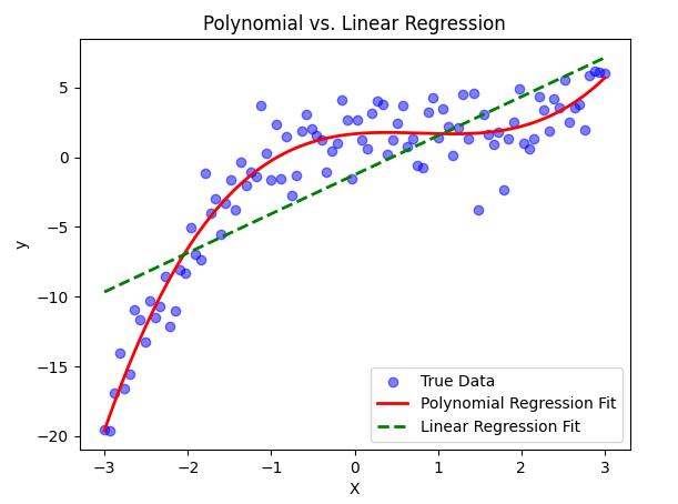
# Train a simple Linear Regression model
linear_model = LinearRegression()
linear_model.fit(X, y)
y_linear_pred = linear_model.predict(X)

# Plot both models
plt.scatter(X, y, color='blue', alpha=0.5, label="True Data")
plt.plot(X, y_pred, color='red', linewidth=2, label="Polynomial Regression Fit")
plt.plot(X, y_linear_pred, color='green', linestyle="dashed", linewidth=2, label="Linear Regression Fit")
plt.xlabel("X")
plt.ylabel("y")
plt.title("Polynomial vs. Linear Regression")
plt.legend()
plt.show()
5. Binary Classification with Logistic Regression
Logistic Regression is a fundamental algorithm used for binary classification problems. It estimates the probability that a given input belongs to a particular class using the sigmoid function.
1. What is Logistic Regression?
Unlike Linear Regression, which predicts continuous values, Logistic Regression predicts probabilities and then maps them to class labels (0 or 1). The model is defined as:
Where:
- represents the model parameters (weights and bias).
- represents the input features.
- The output is a probability between 0 and 1.
2. Generating a Synthetic Dataset (Spam Detection Example)
We’ll create a synthetic dataset where emails are classified as spam (1) or not spam (0) based on two features:
- Number of suspicious words
- Email length
import numpy as np
import matplotlib.pyplot as plt
from sklearn.model_selection import train_test_split
from sklearn.linear_model import LogisticRegression
from sklearn.metrics import accuracy_score

# Generating synthetic data
np.random.seed(42)
num_samples = 200

# Feature 1: Number of suspicious words (randomly chosen values)
suspicious_words = np.random.randint(0, 20, num_samples)

# Feature 2: Email length (short emails tend to be spammy)
email_length = np.random.randint(20, 300, num_samples)

# Labels: Spam (1) or Not Spam (0)
labels = (suspicious_words + email_length / 50 > 10).astype(int)

# Creating feature matrix
X = np.column_stack((suspicious_words, email_length))
y = labels

# Splitting into training and testing sets
X_train, X_test, y_train, y_test = train_test_split(X, y, test_size=0.2, random_state=42)
3. Training the Logistic Regression Model
Now, we train a Logistic Regression model on our dataset.
# Training the model
model = LogisticRegression()
model.fit(X_train, y_train)

# Making predictions
y_pred = model.predict(X_test)

# Evaluating the model
accuracy = accuracy_score(y_test, y_pred)
print(f"Model Accuracy: {accuracy:.2f}")
4. Visualizing Decision Boundary
The decision boundary helps us see how the model separates spam from non-spam emails. We plot the boundary in 2D.
# Function to plot decision boundary
def plot_decision_boundary(model, X, y):
    x_min, x_max = X[:, 0].min() - 1, X[:, 0].max() + 1
    y_min, y_max = X[:, 1].min() - 10, X[:, 1].max() + 10
    xx, yy = np.meshgrid(np.linspace(x_min, x_max, 100),
                         np.linspace(y_min, y_max, 100))

    Z = model.predict(np.c_[xx.ravel(), yy.ravel()])
    Z = Z.reshape(xx.shape)

    plt.contourf(xx, yy, Z, alpha=0.3, cmap=plt.cm.coolwarm)
    plt.scatter(X[:, 0], X[:, 1], c=y, edgecolors='k', cmap=plt.cm.coolwarm)
    plt.xlabel("Suspicious Words Count")
    plt.ylabel("Email Length")
    plt.title("Logistic Regression Decision Boundary")
    plt.show()

# Plotting the decision boundary
plot_decision_boundary(model, X, y)
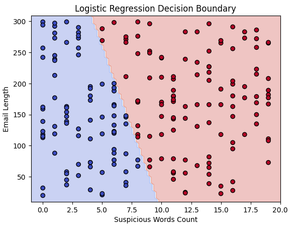
This plot shows how the model separates spam and non-spam emails using our two features.
Key Takeaways
- Logistic Regression is used for binary classification.
- It estimates probabilities using the sigmoid function.
- We generated a synthetic dataset mimicking spam detection.
- We trained and evaluated a Logistic Regression model.
- Decision boundaries help visualize how the model classifies data.
6. Multi-Class Classification with Logistic Regression
In this section, we will implement a Multi-Class Classification model using Logistic Regression. Instead of a binary classification problem, we will classify data points into three distinct categories.
This project predicts a student’s success level based on study hours and past grades using Logistic Regression.
We classify students into three categories:
- Fail (0)
- Pass (1)
- High Pass (2)
Step 1: Import Libraries
We start by importing necessary libraries for:
- Data generation
- Visualization
- Model training
import numpy as np
import matplotlib.pyplot as plt
from sklearn.datasets import make_classification
from sklearn.model_selection import train_test_split
from sklearn.preprocessing import StandardScaler
from sklearn.linear_model import LogisticRegression
from sklearn.metrics import ConfusionMatrixDisplay, classification_report
Step 2: Generate Synthetic Data
We create artificial student data using make_classification.
Each student has:
- Past Grades (0-100)
- Study Hours (non-negative)
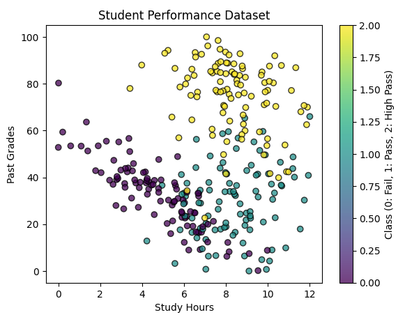
We set random_state = 457897 to ensure reproducibility.
# Generate a classification dataset
X, y = make_classification(n_samples=300,
                           n_features=2,
                           n_classes=3,
                           n_clusters_per_class=1,
                           n_informative=2,
                           n_redundant=0,
                           random_state=457897)  # Ensures consistent results

# Normalize Study Hours to be non-negative & scale Past Grades (0-100)
X[:, 0] = X[:, 0] * 12
X[:, 1] = X[:, 1] * 100

# Scatter plot of generated data
plt.figure(figsize=(7, 5))
plt.scatter(X[:, 0], X[:, 1], c=y, cmap='viridis', edgecolors='k', alpha=0.75)
plt.xlabel("Study Hours")
plt.ylabel("Past Grades")
plt.title("Student Performance Dataset")
plt.colorbar(label="Class (0: Fail, 1: Pass, 2: High Pass)")
plt.show()
Step 3: Split the Data
X_train, X_test, y_train, y_test = train_test_split(X, y, test_size=0.2, random_state=457897, stratify=y)

# Standardizing features for better model performance
scaler = StandardScaler()
X_train = scaler.fit_transform(X_train)
X_test = scaler.transform(X_test)
Step 4: Train Logistic Regression Model
from sklearn.multiclass import OneVsRestClassifier

# Define and train the model
model = OneVsRestClassifier(LogisticRegression(solver='lbfgs'))
model.fit(X_train, y_train)
Step 5: Visualizing Decision Boundaries
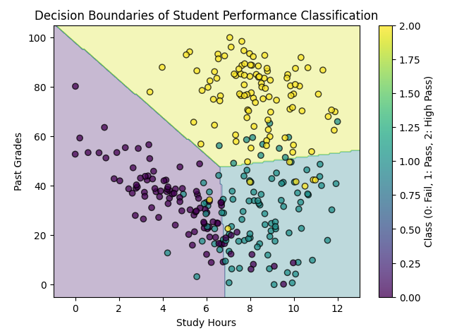
# Define a mesh grid for visualization
x_min, x_max = X[:, 0].min() - 1, X[:, 0].max() + 1
y_min, y_max = X[:, 1].min() - 5, X[:, 1].max() + 5
xx, yy = np.meshgrid(np.linspace(x_min, x_max, 200),
                     np.linspace(y_min, y_max, 200))

# Predict on the mesh grid
Z = model.predict(scaler.transform(np.c_[xx.ravel(), yy.ravel()]))
Z = Z.reshape(xx.shape)

# Plot decision boundary
plt.figure(figsize=(7, 5))
plt.contourf(xx, yy, Z, alpha=0.3, cmap="viridis")
plt.scatter(X[:, 0], X[:, 1], c=y, cmap="viridis", edgecolors='k', alpha=0.75)
plt.xlabel("Study Hours")
plt.ylabel("Past Grades")
plt.title("Decision Boundaries of Student Performance Classification")
plt.colorbar(label="Class (0: Fail, 1: Pass, 2: High Pass)")
plt.show()